top of page

ayson
gr
se
rif
a
modern serif
by dave johnson
alphabet
abcdefghijklmnopqrstuvwxyz
123456789
.:,;'!?"

in
fluences
The main thought in creating this typeface was to take the ideas behind a modern sans-serif and develop it into a serif that would be functional for many purposes.
One of the first major influences I liked was Bodoni. Block-serifs have a neat appeal and the high contrast look is great as well.
The unique way that this typeface Querist was setup was interesting as a modern sans-serif and some elements from it were considered in grayson-serif.

V
ersus
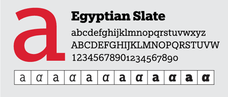
old slab-serif
This egyptian slate is fairly high contrast in its own right, and shows an old style with a new appeal in many ways, being created in 2008. The blocked out look it brings to the characters made me think about how such a look could be incorporated into a newer modern sans-serif to make something slick and unique with an old touch to a modern look.
modern sans-serif

Much like the Querist font, Alodie is another example of a modern sans-serif. I love the high contrast appeal again, and adding that classic look that serifs bring has brought something old back to life along this new style. Jazzing up young and aspiring typefaces to bring back an art-deco look from 100 years ago was challenging but worth it in every sense.

c
the
problem
The letter c went through various phases before becoming what it is in the final typeface. I started off by having serifs off of both ends, but it looked really irregular, especially when it was in lowercase form. The next idea came in making the top serif tilt back some, while making the tail of the c being thicker on the edge. The roundness didn't look right, so it was eventually blocked off to make a nice clean c that fit the rest of the typeface correctly.


j
la
This j went through a few transformations as well, since it was started from the uppercase version of it. Just as with the c, the end didn't feel right when it was first transitioned and needed to come in to a nice point. This later helped lay the foundations of the f and t, which all look much cleaner than the original conception that needed to be pulled in some.
g
et
Going for the right g was tough and had several stages. The first version felt like it was really tucked in and had been based off the J's tail. The next version came out a little more and was pointed, but didn't flow well with the blocked out look on the tips of other things. Eventually the final version came out high contrast with a nice tail on the end that fits with the other letters.


f
us
Some uses that came to mind immediately with this font was for an art-deco feel and throwback to the 1920s. It is very high contrast, much like the style of that period was with thin and bold lines intersecting. Below is an example of what kind of poster you could make with it. Razzle dazzle your patrons with this awesome font!
e
inding
Some other uses that come to mind are high class events, newsletters, contemporary websites that talk about old things from the 20th century, and even college campuses looking to tie in the old with the new. The high contrast look goes well with a number of needs and uses.


r
eflections
Before the lower case part of this project started this semester, I had made the entire upper alphabet for it. This helped shape some of the foundations of the lowercase letters mainly being featured on this portfolio page. A lot of hard work and looking at letters for hours went into this, and it is so refreshing to see the end result and how clean it looks with the gold and black packaging. I hope that others will someday use it as a typeface in their designs, as I know I will for a multitude of design needs. Missions always feel complete when you can see them come alive in something that is usable by a consumer on the internet, so I feel like this typeface is now ready to be used more in real life applications.
ayson
gr
se
rif
designs for your life
This typeface was designed as part of the Metropolitan State Universities Communication Design program, in the typographic aesthetics class, Fall 2020 in the midst of the Coronavirus pandemic.

bottom of page